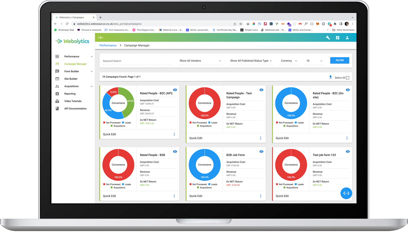
Affiliate's Campaign Management
To view a campaign, hover over the blue eye icon, then select “View”.
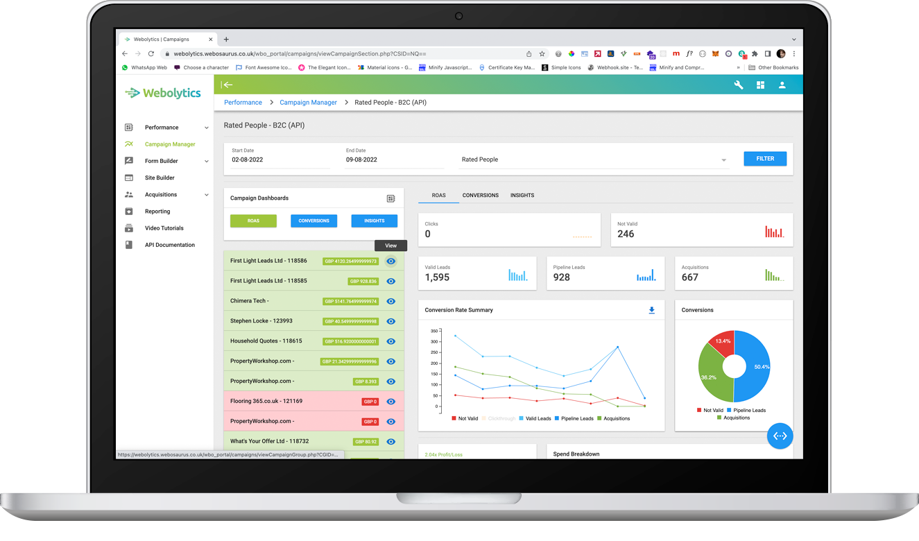
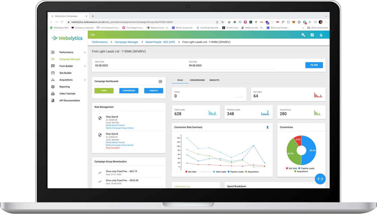
The “Return on Ad Spend” (ROAS) dashboard will automatically load. This section gives you a brief overview of your current active campaigns. A clear conversion rate summary, campaign profit/loss breakdown and a list of current campaigns are on display.
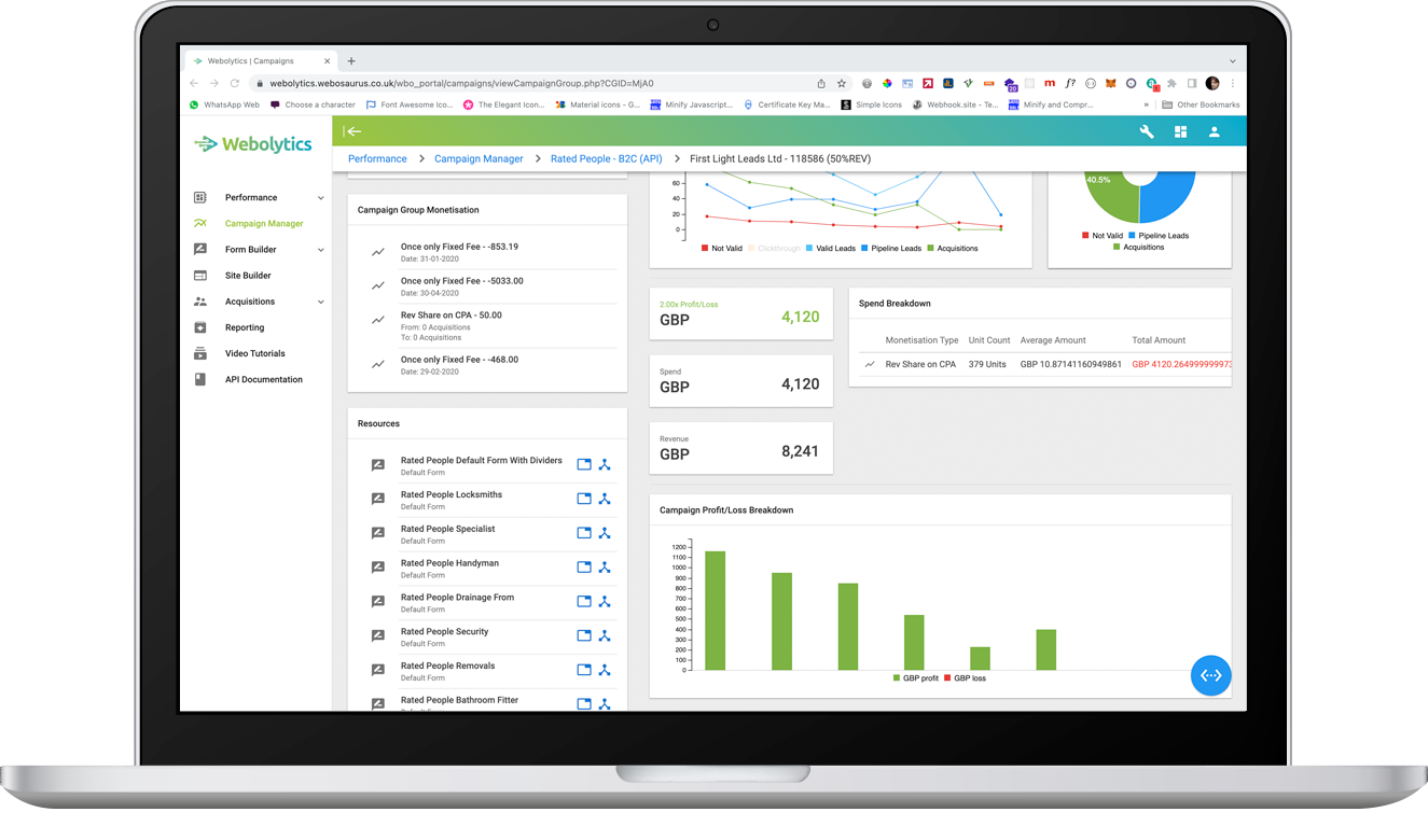
To get the i-Frame and API for the campaign, select the “eye” icon next to the selected campaign group.
For the i-Frame, Scroll down to "resources" click the left button and copy it to your clipboard. For the API select the right button.
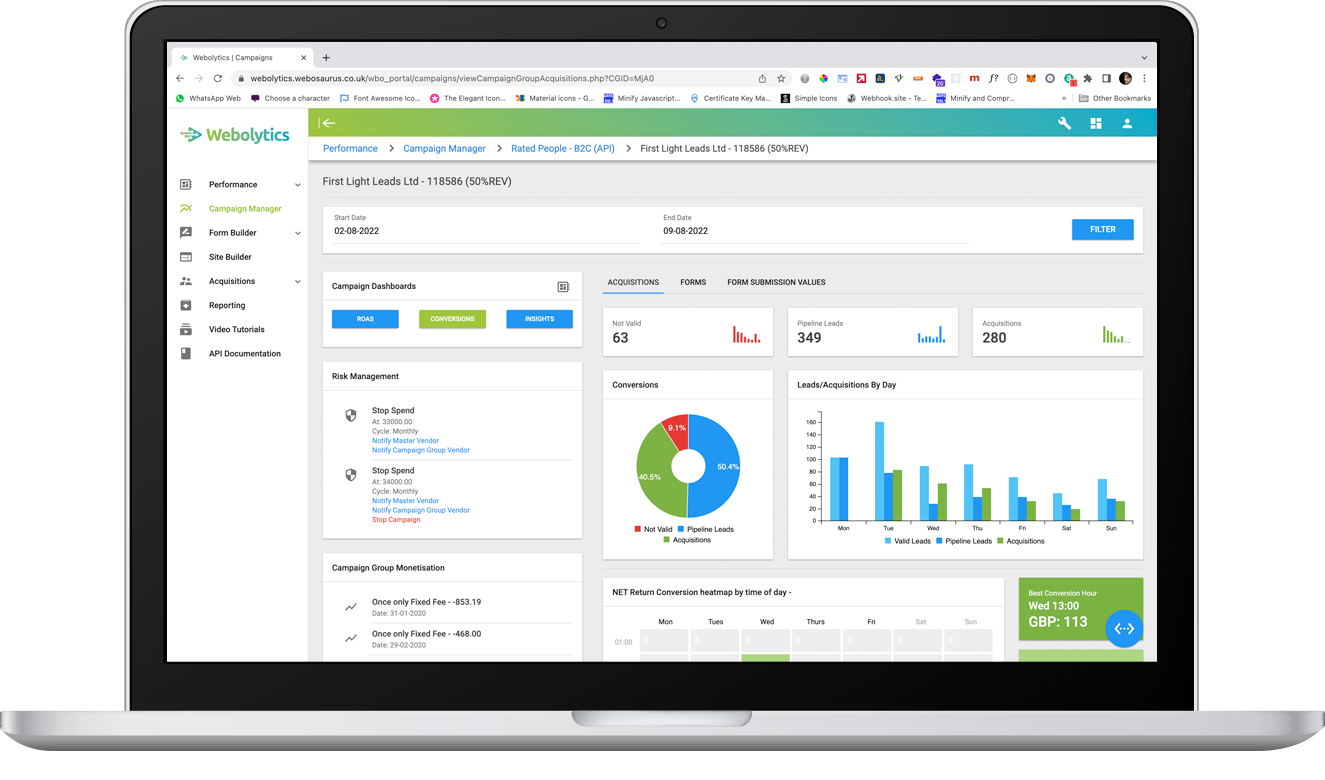
The “Conversions” section is a more granular conversion summary. At the top you’re able to see the number of leads and acquisitions, by day, over your filtered period. As you scroll down, you’ll see a net return conversion heatmap by time of day. At the bottom, you can see all your active forms and how many acquisitions, leads and invalid leads they have garnered.
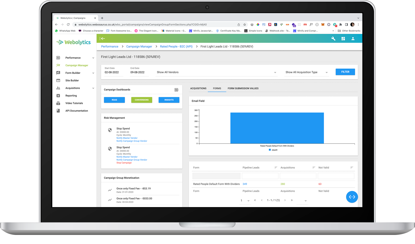
The “Forms” section shows the number of emails input into each form.
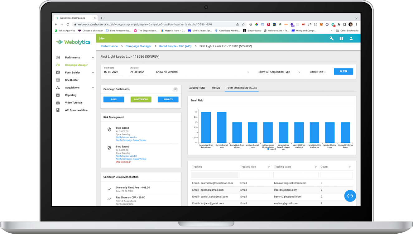
The “Form Submission Values” shows who has submitted the most number of forms. This is great for identifying loyal customers.
Insights gives you even more information to help optimise your campaign. There’s a clear graphical summary, conversion pie chart, there’s then pipeline lead and acquisition conversion heatmaps. Highlights of “Top 3” conversion times. A list of the “Top 4” for website links and referrals, as well as a list of all your active campaigns.
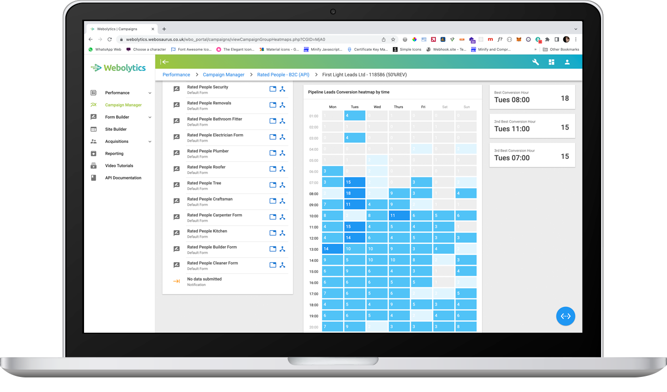
The heatmap section is similar to the ROAS one, however shows conversions instead of ROAS.
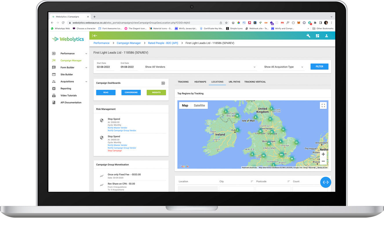
The “Locations” section gives you a visual representation of where your leads are being generated. Zoom in on the interactive map to get a greater idea of the locational spread of your leads.
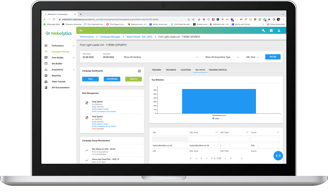
The “URL Paths” section shows where your campaign is receiving the most traffic from.
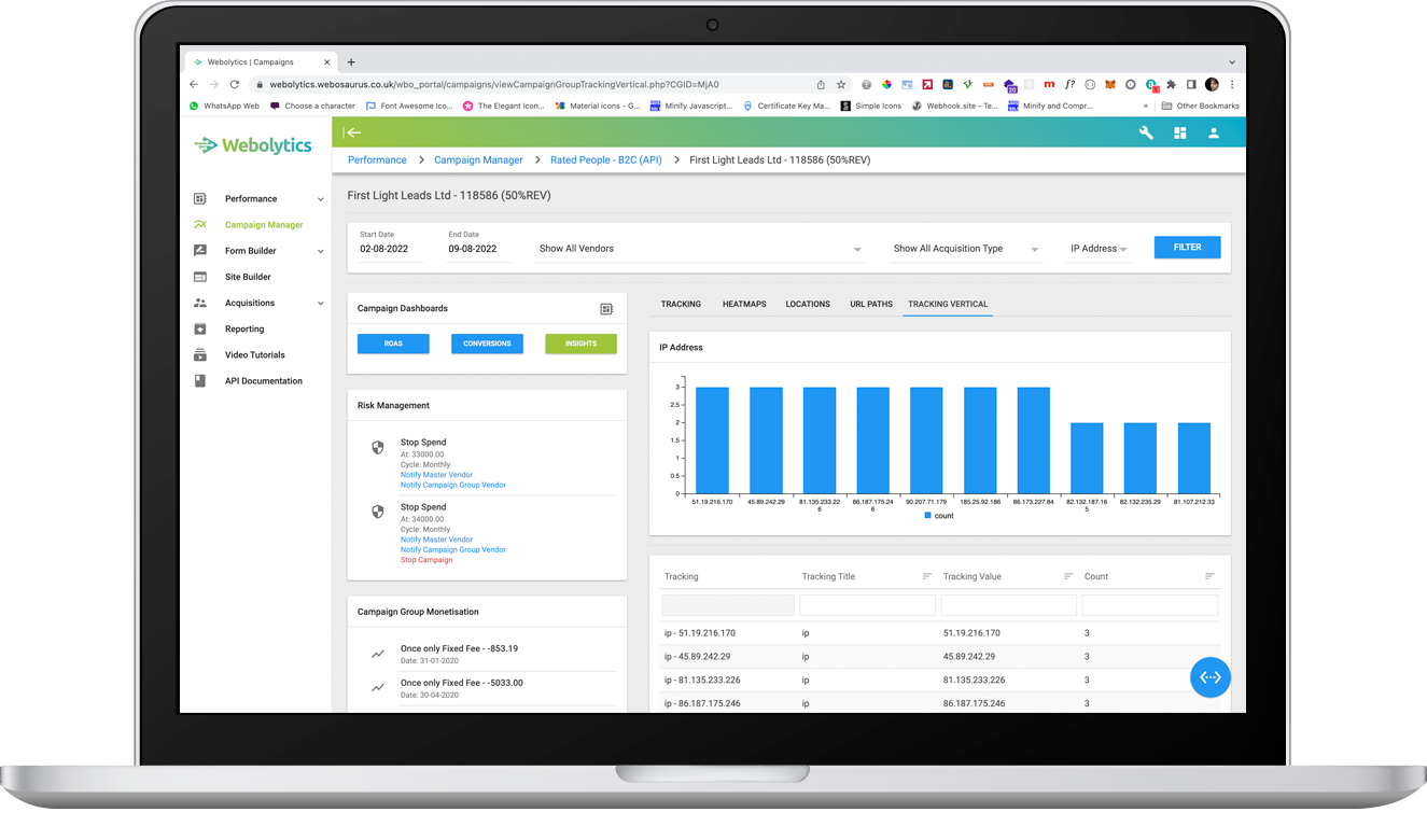
“Tracking Vertical” shows which browsers are used the most, however isn’t accessible to affiliates.